
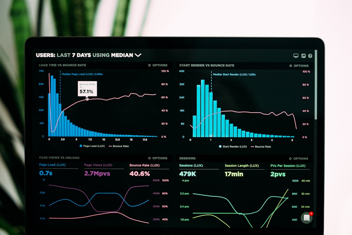
ChatGPT Advanced Data Analysis: The Data Analyst's Best New Friend
⚡ Quick Answer
ChatGPT Advanced Data Analysis (Code Interpreter) writes and runs real Python on files you upload — CSV, Excel, PDF, images — to clean data, run statistics, and generate downloadable charts, all without you writing any code.
Get more content like this on Telegram!
Daily AI tips, notes & resources — free
Advertisement
ChatGPT Advanced Data Analysis: The Data Analyst's Best New Friend
I work with spreadsheet data constantly. Not as a data scientist — as a marketer who needs to pull insights from campaign data, customer data, and performance reports that usually come in Excel files with inconsistent formatting and 40 columns I don't need.
Before Advanced Data Analysis: I'd spend 45 minutes cleaning the file, another 30 minutes on pivot tables or VLOOKUP chains, and then still not have a clean visualization I could put in a slide.
After: I upload the file, describe what I want to understand, and get analysis and charts in 5 minutes.
This is the workflow guide I wish I'd had when I started using it.
What Advanced Data Analysis Actually Does
It writes Python code — you don't see it unless you ask — and executes that code against your data. The practical result:
- Upload a messy CSV → get a cleaned, reformatted version
- Upload sales data → get trend analysis, charts, and statistical summaries
- Upload multiple files → get merged, cross-referenced analysis
- Upload a dataset with questions → get answers computed from actual calculation, not AI guessing
The key distinction from regular ChatGPT: when it does math or analysis here, it's actually running code. The numbers are real, not generated.
Getting Started: Your First Analysis
Upload any CSV or Excel file and start with:
Analyze this dataset. Give me: (1) an overview of what's in the file — column names, data types, sample rows; (2) basic descriptive statistics for numerical columns; (3) any obvious data quality issues I should know about.
This orientation prompt tells you what you're working with before you start asking specific questions. It reliably identifies:
- Missing values
- Inconsistent date formats
- Numerical columns stored as text
- Duplicate rows
- Outlier values that might be data errors
Workflow 1: Sales Data Analysis
Scenario: Monthly sales CSV with columns for Date, Product, Region, Sales Rep, Revenue, Units Sold.
Analysis prompts that work:
Calculate total revenue by region. Show as a bar chart sorted by revenue descending. Also tell me which region has the highest revenue per unit.
Show me month-over-month revenue trend for the last 12 months as a line chart. Calculate the average monthly growth rate.
Which 10 products account for the most total revenue? Show as a pie chart. What percentage of total revenue do the top 10 represent?
Identify the top 5 and bottom 5 sales reps by total revenue. For each, show their revenue, units sold, and average revenue per sale.
Are there any months where revenue dropped more than 15% from the previous month? If so, which products or regions drove the decline?
Each prompt produces both the analysis and the Python code used. If you want to verify the methodology, ask "show me the code" — you'll see exactly what calculation was performed.
Workflow 2: Data Cleaning
Advanced Data Analysis is excellent for messy data that would take significant manual effort to clean.
Common cleaning tasks:
Standardizing dates:
The date column has mixed formats (some MM/DD/YYYY, some YYYY-MM-DD, some "January 5, 2025"). Standardize all dates to YYYY-MM-DD format. Export the cleaned file.
Removing duplicates:
Check for duplicate rows based on [column name]. Show me how many duplicates exist, give me a sample, then create a cleaned version without duplicates.
Handling missing values:
The Revenue column has 47 missing values. Show me where they appear in the data. Then create two versions: one with missing values removed, one with missing values filled with the column median. I'll decide which to use.
Standardizing text:
The "Region" column has inconsistent capitalization and some typos ("north east," "North East," "NE," "Northeast"). Standardize all to a consistent format and show me the mapping before applying it.
Splitting columns:
The "Name" column has full names in "Last, First" format. Split into two separate columns: "First Name" and "Last Name."
Workflow 3: Generating Presentation-Ready Charts
Create a professional-looking bar chart of revenue by product category. Color scheme: use shades of blue. Include: proper axis labels, a title ("Revenue by Product Category — Q1 2026"), value labels on each bar, and a note at the bottom with the total. Export as PNG at 300 DPI for use in a presentation.
Generate a dashboard-style summary with 4 charts in a 2x2 grid: top-left is monthly revenue trend, top-right is revenue by region, bottom-left is top 10 products by revenue, bottom-right is a scatter plot of units sold vs. revenue by product. Title the overall figure "Sales Performance Summary."
The charts aren't always perfectly formatted on the first try — iterate with specific feedback:
The font in the bar chart is too small. Increase it. Also rotate the x-axis labels 45 degrees so they don't overlap.
Workflow 4: Multi-File Analysis
You can upload multiple files and ask ChatGPT to cross-reference them:
I've uploaded two files: customer_data.csv (customer IDs, demographics, acquisition date) and purchase_history.csv (customer ID, purchase date, product, amount). Join these on customer ID. Then: (1) Calculate average lifetime value by acquisition channel, (2) Identify customers who have purchased more than 5 times, (3) Show the distribution of time between first and second purchase.
Workflow 5: Statistical Analysis Without Writing Code
For people who know what analysis they want but not how to execute it:
Run a simple linear regression with "Marketing Spend" as the independent variable and "Revenue" as the dependent variable. Show: the regression equation, R-squared value, and whether the relationship is statistically significant. Explain the results in plain English for a non-statistician.
Calculate the correlation matrix for all numerical columns in this dataset. Highlight correlations above 0.7 in a heatmap. Tell me which pairs of variables are most strongly correlated and what that might mean.
I have two groups: customers who received the new email campaign (group A) and those who didn't (group B). Compare their average order values. Run a t-test to see if the difference is statistically significant. Interpret the result in plain language.
Limitations to Know
File size: Large files (>50MB) may hit processing limits. For very large datasets, sample or aggregate before uploading.
Session persistence: The uploaded file and generated code don't persist between conversations. Start fresh conversations for new analyses.
Complex PDFs: PDF text extraction works; structured tables in PDFs are unreliable. Convert to CSV first when possible.
Methodology verification: Advanced Data Analysis picks an analytical approach based on your question. Verify it chose the right method — "show me the code" and review the approach before trusting results you'll act on.
Further Reading
- How Teachers Are Using ChatGPT to Save 10 Hours a Week
- ChatGPT for Language Learning: Become Fluent Faster
- ChatGPT Plugins and GPTs in 2026: The 20 Most Useful Ones Ranked
- ChatGPT for Mental Health Support: Prompts and Ethical Limits
- ChatGPT for Fitness and Nutrition: Build Your Personal Plan
- How to Remove Vocals From Songs Using Free AI Tools (2026)
- How QuillBot Saved My Academic Career (A Graduate Student's Story)
- Jailbreak or Not? Understanding the Ethics of Prompt Manipulation
Advertisement
💬 DiscussionPowered by GitHub Discussions
Frequently Asked Questions

AiTechWorlds Team
✓ Verified WriterThe AiTechWorlds team is passionate about AI, technology, and education. We create high-quality, research-backed content to help you learn, grow, and succeed in the modern digital world.
Advertisement
Related Articles

10 Advanced ChatGPT Prompting Techniques (Chain of Density and More)
Master advanced ChatGPT prompting with Chain of Density, Chain of Thought, Tree of Thoughts, role stacking, and 6 more expert techniques with real examples.

How to Avoid ChatGPT Hallucinations in Research and Writing
Learn 7 practical techniques to avoid ChatGPT hallucinations in academic research, with a verification workflow, tools, and honest limits you need to know.

7 ChatGPT Plugins That Save 10 Hours Weekly
The best ChatGPT plugins and GPTs in 2026 for freelancers. Real use cases, honest time estimates, and which ones actually deliver results.

ChatGPT for Academic Research: Citations and Summaries
ChatGPT as a research assistant for students and academics: literature review prompts, citation formatting, summarization workflows, and critical hallucination warnings.