
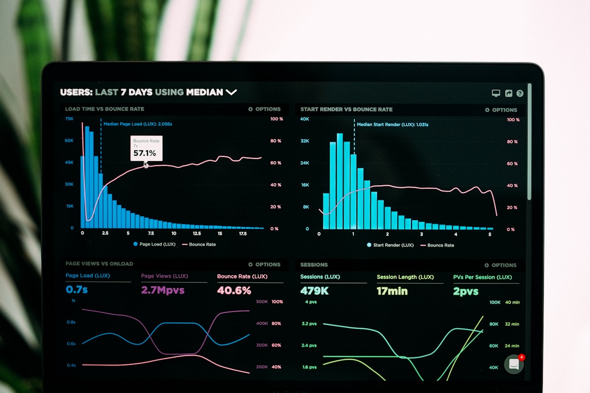
How to Use ChatGPT Code Interpreter for Data Visualization
⚡ Quick Answer
To visualize data in ChatGPT, upload a CSV or Excel file to Code Interpreter (Advanced Data Analysis) and describe the chart in plain English. It writes and runs the Python, shows the chart, and exports it as a PNG — no coding required.
Get more content like this on Telegram!
Daily AI tips, notes & resources — free
Advertisement
I spent the first two years of my data analysis career learning matplotlib syntax I kept forgetting between projects. Every time I needed a specific chart type, I was back on Stack Overflow. ChatGPT Code Interpreter changed that. Now I describe what I want in plain English, and it writes and runs the Python code — I see the chart, then decide if I want adjustments.
This guide covers a real workflow: from uploading a messy CSV, to cleaning it, to generating publication-quality charts, to exporting everything. If you're a data analyst, marketing analyst, or anyone who works with spreadsheets and needs to communicate data visually, this is one of the most immediately useful things in ChatGPT.
What Code Interpreter Actually Is
Code Interpreter (now often called Advanced Data Analysis in the ChatGPT interface) is a feature in ChatGPT Plus and higher plans that gives ChatGPT a live Python environment. It can write Python code, run it, and show you the output — all within the chat.
This is fundamentally different from ChatGPT's regular text mode, where it can discuss Python code but can't execute it. With Code Interpreter, the code actually runs. Charts appear in the chat. Data transformations happen. Errors get caught and debugged automatically.
The environment includes popular data and visualization libraries pre-installed: pandas, numpy, matplotlib, seaborn, scipy, scikit-learn, and more. You don't need to install anything. You just upload your data and start asking questions.
How to Upload a CSV and Start Exploring
The first step is enabling Code Interpreter and uploading your file.
- Start a new ChatGPT conversation
- Click the paperclip icon (or file attachment option) in the chat input
- Upload your CSV or Excel file
- Wait for the upload to confirm
Once uploaded, start with an exploratory prompt:
"I've uploaded a CSV file. Please give me an overview: how many rows and columns, what each column represents based on the headers and sample values, data types, any missing values, and any obvious issues with the data quality."
This single prompt generates a useful summary — column types, null counts, value ranges — that would take ten minutes to produce manually. It also flags problems early: mixed date formats, string values in numeric columns, duplicate rows.
Good follow-up exploration prompts:
- "Show me the first 10 rows in a formatted table"
- "What are the unique values in the [column name] column?"
- "Calculate descriptive statistics for all numeric columns"
- "How many missing values are there in each column? Show as a percentage"
Data Cleaning Prompts That Save Hours
Raw data is almost never clean. Inconsistent formatting, missing values, duplicates, and outliers are the norm. Code Interpreter handles cleaning tasks that would take significant pandas knowledge to do from scratch.
Missing value handling
"For columns with missing values: fill numeric columns with the median and fill categorical columns with the mode. Tell me what you filled and how many values were affected."
Duplicate removal
"Check for duplicate rows. Show me how many duplicates exist, then remove them and confirm the final row count."
Date formatting
"The [date column] column has inconsistent date formats — some are MM/DD/YYYY and some are YYYY-MM-DD. Convert all to YYYY-MM-DD format and create a separate 'year' and 'month' column."
Outlier detection
"Identify statistical outliers in [column name] using the IQR method. Show me how many there are, their values, and ask me whether to remove or cap them before proceeding."
String cleaning
"Clean the [text column] column: strip leading and trailing whitespace, convert to lowercase, and remove any special characters except hyphens and apostrophes."
I used a sequence like this on a client's sales data that had been manually entered over two years. The cleaning process that would have taken me half a day in Excel took about twenty minutes of back-and-forth with Code Interpreter.
For more on structured data prompting, the ChatGPT code interpreter guide covers the full range of analysis tasks beyond visualization.
Generating matplotlib and seaborn Charts
Once your data is clean, visualization is where Code Interpreter gets fun. You can request any chart type in plain English.
Bar charts
"Create a horizontal bar chart showing [metric] by [category column]. Sort by highest value. Use a blue color palette. Add value labels on each bar. Title: '[your title]'. Make the chart high resolution."
Line charts for time series
"Create a line chart showing [metric] over time using the [date column] as the x-axis. If there are multiple series (grouped by [column]), show each as a separate colored line with a legend. Add gridlines and a clean background."
Scatter plots for correlation
"Create a scatter plot with [column A] on the x-axis and [column B] on the y-axis. Color the points by [category column]. Add a trend line. Label any obvious outliers."
Histograms and distributions
"Create a histogram for [column] showing the distribution. Overlay a kernel density estimate curve. Add vertical lines for mean and median. Use 30 bins."
Heatmaps
"Create a correlation heatmap for all numeric columns in the dataset. Use a diverging color scheme (red for negative, blue for positive correlation). Annotate each cell with the correlation value."
Multi-chart dashboard
"Create a 2x2 subplot figure with: top-left showing [chart 1], top-right showing [chart 2], bottom-left showing [chart 3], bottom-right showing [chart 4]. Use consistent styling across all charts. Title the overall figure '[dashboard title]'."
Customizing Chart Appearance
ChatGPT will generate reasonable default styling, but you can push it toward professional output.
Style improvement prompts:
- "Make this chart publication-ready: increase font sizes, clean up the axes labels, remove the top and right spines, and use the 'seaborn-v0_8-whitegrid' style"
- "Change the color palette to [specific palette: viridis / coolwarm / Blues / your brand colors in hex]"
- "Increase the figure size to 12x8 inches at 150 DPI"
- "Add a text annotation on the chart pointing to [specific data point] explaining [what it represents]"
Seaborn's documentation is a useful reference if you want to understand what ChatGPT is generating or request more advanced statistical visualizations by name.
A Real Workflow Example: Marketing Data Analysis
Here's how this plays out in practice. Say I have a CSV of monthly website traffic by channel (organic, paid, social, email) over two years. Here's the sequence I'd run:
- Upload the CSV, ask for an overview
- Clean: check for missing months, consistent column names, correct data types
- Explore: "What were the three highest-traffic months overall? Which channel drove the most growth?"
- Visualize: "Create a stacked area chart showing traffic by channel over time"
- Analyze: "Calculate month-over-month growth rates for each channel. Which channel is growing fastest?"
- Export: "Save the cleaned dataset as a new CSV and give me a download link. Also save the stacked area chart as a PNG at 200 DPI."
The whole thing, start to finish, takes about 30-40 minutes including reviewing and adjusting outputs. The same workflow in Excel or a Jupyter notebook would take several hours for someone who isn't a daily Python user.
Combining Analysis with Visualization
Code Interpreter's real power emerges when you combine analysis and visualization in the same conversation — not just making charts, but asking analytical questions and visualizing the answers.
Combined analysis prompts:
- "Segment customers into quartiles by [spend column]. Create a box plot comparing [another metric] across the four quartiles. Also tell me the median value for each quartile."
- "Calculate 30-day rolling averages for [metric column]. Plot both the raw data and the smoothed line on the same chart."
- "Build a simple linear regression predicting [outcome] from [predictor columns]. Show the model coefficients and create a residual plot."
- "Find the top 10 and bottom 10 [category] by [metric]. Create a side-by-side bar chart comparison."
Exporting Your Work
When you're done, you can export both the data and the visualizations.
Export prompts:
- "Save the cleaned and transformed dataset as [filename].csv and give me a download link"
- "Save all charts we created today as PNG files in a zip archive"
- "Generate the full Python code for everything we did in this session so I can reproduce it in my own environment"
- "Export a summary statistics table as an Excel file with formatting"
The code export is particularly useful — you get working, annotated Python code that you can run in Jupyter or any Python environment. Even if you don't use Code Interpreter regularly, generating the code once and saving it is a genuine learning resource.
Towards Data Science has extensive guides on matplotlib customization if you want to go deeper on styling beyond what ChatGPT produces by default.
For context on how Code Interpreter fits into a broader ChatGPT workflow, the ChatGPT prompt bible covers analytical prompting patterns in detail.
Common Issues and How to Fix Them
Chart doesn't render: Ask "run the visualization code again and show me any error messages." Usually a minor syntax issue that self-corrects.
Wrong chart type selected: Be more specific. "I want a grouped bar chart, not a stacked bar chart. Regenerate."
Data interpretation errors: If ChatGPT misunderstands a column (treating a categorical number as continuous), correct it explicitly: "The [column] column contains category IDs, not continuous values. Treat it as categorical."
Slow performance with large files: For files over 100k rows, tell it to sample first: "Work with a random 10,000-row sample for exploration. We'll use the full dataset for final charts."
Conclusion
ChatGPT Code Interpreter handles the parts of data visualization that slow most analysts down: cleaning messy inputs, writing boilerplate chart code, iterating on styling, and exporting results. The conversational interface makes it faster than writing code from scratch and more flexible than BI tools with fixed templates.
The workflow — upload, explore, clean, visualize, export — takes practice to get smooth, but it pays off quickly. Even one or two sessions with real data will show you where it saves the most time in your specific work.
Start with a CSV you've been meaning to analyze and run the exploratory overview prompt. See what it finds in five minutes that you hadn't looked at yet.
Further Reading
- ChatGPT for Personal Finance: Budgeting and Investing Tips
- 10 Advanced ChatGPT Prompting Techniques (Chain of Density and More)
- 100+ ChatGPT Prompts for Entrepreneurs (Organized by Need)
- How to Use ChatGPT Voice Mode for Meetings and Calls
- ChatGPT for Fitness and Nutrition: Build Your Personal Plan
- Jailbreak or Not? Understanding the Ethics of Prompt Manipulation
Advertisement
💬 DiscussionPowered by GitHub Discussions
Frequently Asked Questions

AiTechWorlds Team
✓ Verified WriterThe AiTechWorlds team is passionate about AI, technology, and education. We create high-quality, research-backed content to help you learn, grow, and succeed in the modern digital world.
Advertisement
Related Articles

10 Advanced ChatGPT Prompting Techniques (Chain of Density and More)
Master advanced ChatGPT prompting with Chain of Density, Chain of Thought, Tree of Thoughts, role stacking, and 6 more expert techniques with real examples.

How to Avoid ChatGPT Hallucinations in Research and Writing
Learn 7 practical techniques to avoid ChatGPT hallucinations in academic research, with a verification workflow, tools, and honest limits you need to know.

7 ChatGPT Plugins That Save 10 Hours Weekly
The best ChatGPT plugins and GPTs in 2026 for freelancers. Real use cases, honest time estimates, and which ones actually deliver results.

ChatGPT for Academic Research: Citations and Summaries
ChatGPT as a research assistant for students and academics: literature review prompts, citation formatting, summarization workflows, and critical hallucination warnings.